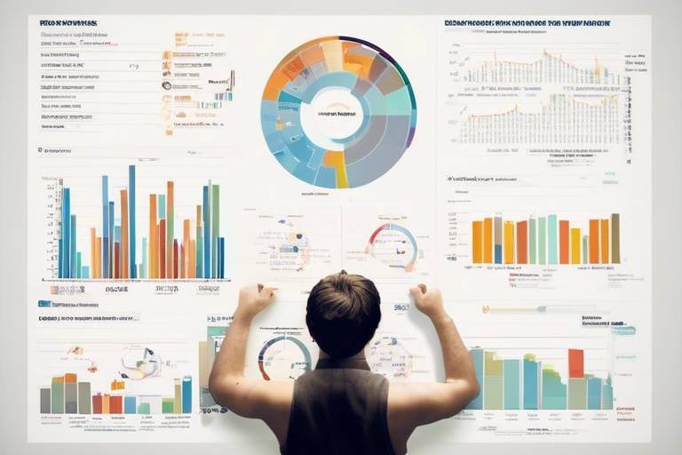
How to Use Charts for Effective Market Predictions
In the fast-paced world of trading, making informed decisions can be the difference between profit and loss. One of the most powerful tools at a trader's disposal is the ability to interpret charts. Charts are not just pretty pictures; they are visual representations of market data that can help traders predict future price movements. By leveraging various charting techniques, traders can gain insights that are not always evident from raw data alone. This article will explore how to use charts effectively for market predictions, diving into different chart types, key indicators, and patterns that can enhance your trading strategies.
When it comes to market analysis, understanding the different types of charts is crucial. Each chart serves a unique purpose and can provide different insights into market behavior. The three most common types of charts include:
- Line Charts: These are the simplest form of charts, showing price movements over time with a continuous line. They are great for visualizing overall trends but may miss out on specific price points.
- Bar Charts: Bar charts provide more detail than line charts, showing opening, closing, high, and low prices for a given time period. This type of chart offers a clearer picture of market volatility.
- Candlestick Charts: These are similar to bar charts but are visually more appealing. Each candlestick represents price action for a specific period, with colors indicating whether the price increased or decreased. Candlestick patterns are particularly useful for predicting short-term movements.
By mastering these chart types, traders can better analyze market conditions and make more informed decisions.
Technical indicators are the bread and butter of market analysis. They help traders interpret chart data and forecast future price movements. Some of the most popular indicators include:
- Moving Averages
- Relative Strength Index (RSI)
- Moving Average Convergence Divergence (MACD)
These indicators can significantly enhance your chart interpretation, allowing you to spot trends and reversals with greater accuracy.
Moving Averages smooth out price data to identify trends over time. By calculating the average price over a specific period, traders can filter out the noise and focus on the underlying trend. There are two primary types of moving averages:
The Simple Moving Average is calculated by averaging a set of prices over a specific period. For example, a 10-day SMA takes the average of the last ten days' closing prices. This indicator is significant for identifying support and resistance levels. When the price approaches the SMA, it can act as a barrier, influencing traders' decisions.
On the other hand, the Exponential Moving Average gives more weight to recent prices, making it more responsive to new information. This characteristic is invaluable for capturing market momentum. Traders often use the EMA in conjunction with the SMA to confirm trends and make informed trading decisions.
The Relative Strength Index is a momentum oscillator that measures the speed and change of price movements. Ranging from 0 to 100, an RSI above 70 typically indicates that an asset is overbought, while an RSI below 30 suggests it is oversold. Traders can use these levels to identify potential reversals, making the RSI a powerful tool in their arsenal.
Recognizing chart patterns is crucial for predicting future price movements. Several common patterns can provide valuable insights:
- Head and Shoulders: This pattern signals potential trend reversals.
- Triangles: These indicate periods of consolidation and potential breakout points.
- Flags: These suggest a continuation of the existing trend.
By familiarizing yourself with these patterns, you can better anticipate market movements and adjust your trading strategy accordingly.
The head and shoulders pattern is one of the most reliable reversal patterns. It consists of three peaks: a higher peak (head) between two lower peaks (shoulders). When this pattern forms, it often indicates that the current trend is losing momentum, providing traders with an opportunity to enter a position before a significant price shift occurs.
Triangle patterns, including ascending, descending, and symmetrical triangles, indicate periods of consolidation and are often precursors to breakout points. Ascending triangles suggest bullish sentiment, while descending triangles indicate bearish sentiment. Understanding these patterns can help traders make informed decisions about when to enter or exit positions.
Volume is a key factor in confirming trends and patterns. Analyzing trading volume can provide deeper insights into market strength and direction. When price movements are accompanied by high volume, it signals strong conviction among traders, whereas low volume can indicate a lack of interest or uncertainty.
Understanding volume trends can provide insight into market strength. For instance, increasing volume during a price rise can confirm a bullish trend, while decreasing volume during a price drop may suggest a lack of selling pressure. This relationship is crucial for traders looking to validate their strategies.
Various volume indicators, such as On-Balance Volume (OBV) and Chaikin Money Flow, can enhance market analysis. These indicators help traders gauge the strength of price movements and can be instrumental in predicting future price actions.
1. What is the best chart type for beginners?
Line charts are often recommended for beginners due to their simplicity and clarity. They provide a straightforward view of price movements over time.
2. How can I use the RSI in my trading strategy?
You can use the RSI to identify overbought or oversold conditions. If the RSI is above 70, consider selling; if it's below 30, think about buying.
3. What does a high volume during a price increase indicate?
High volume during a price increase typically indicates strong buying interest, suggesting that the trend is likely to continue.
4. How often should I analyze charts?
This depends on your trading strategy. Day traders may analyze charts multiple times a day, while long-term investors may do so weekly or monthly.

Understanding Chart Types
When it comes to market analysis, visual representation of data plays a pivotal role. Different types of charts serve various purposes, and understanding these can be the difference between a successful trade and a missed opportunity. Let's dive into three primary chart types that traders frequently use: line charts, bar charts, and candlestick charts.
Line charts are perhaps the simplest form of charting. They connect individual data points with a continuous line, making it easy to see the overall trend of an asset's price over time. This type of chart is particularly useful for identifying long-term trends, as it smooths out short-term fluctuations. Imagine looking at a mountain range; the peaks and valleys represent price movements, while the line gives you a clear view of the overall elevation. Line charts are excellent for traders who prefer a straightforward approach to market analysis.
On the other hand, bar charts provide more detailed information. Each bar represents a specific time period and shows the opening, closing, high, and low prices within that period. This additional data allows traders to gauge the volatility and price range of an asset more effectively. Think of bar charts as the detailed report card of a student, where you can see not just the final grade (closing price) but also how they performed throughout the semester (highs and lows). This insight can help traders make more informed decisions based on price movements.
Now, let's talk about candlestick charts, which are like bar charts but with a twist. Each candlestick represents a specific time frame and displays the same price data as bar charts but in a more visually appealing way. The body of the candlestick shows the opening and closing prices, while the wicks (or shadows) indicate the high and low prices. The color of the candlestick (typically green for bullish and red for bearish) gives traders an immediate visual cue about market sentiment. If you think of candlesticks as a storybook, each candlestick tells a part of the story of price movement, allowing traders to read the market's narrative at a glance.
Here's a quick comparison of these three chart types:
| Chart Type | Data Representation | Best For |
|---|---|---|
| Line Chart | Connects closing prices | Identifying long-term trends |
| Bar Chart | Shows open, high, low, close | Assessing volatility and price range |
| Candlestick Chart | Displays open, high, low, close with colors | Understanding market sentiment |
In summary, each chart type offers unique insights that cater to different trading styles and preferences. By understanding the strengths and weaknesses of line charts, bar charts, and candlestick charts, traders can better analyze market movements and make more informed decisions. So, which chart type resonates with you? Are you a straightforward line chart kind of trader, or do you prefer the detailed narratives of candlestick charts? The choice is yours, but knowing your tools is the first step toward mastering market predictions.

Key Indicators for Analysis
When it comes to market analysis, understanding key indicators can significantly enhance your ability to make informed decisions. These indicators act like a compass, guiding traders through the often turbulent waters of financial markets. By using technical indicators, traders can analyze price movements and identify potential trends, thereby improving their market predictions. Among the most popular indicators are the Moving Averages, Relative Strength Index (RSI), and Moving Average Convergence Divergence (MACD). Each of these tools serves a unique purpose and can be combined to provide a more comprehensive view of market conditions.
Let's dive deeper into these indicators to understand how they can be leveraged effectively:
Moving Averages are vital in smoothing out price data to identify trends over a specific period. They help traders eliminate the noise of daily price fluctuations, allowing for a clearer view of the market's direction. There are two main types of Moving Averages: the Simple Moving Average (SMA) and the Exponential Moving Average (EMA). The SMA calculates the average of prices over a set period, while the EMA gives greater weight to recent prices, making it more responsive to new information. Both types can be used to identify support and resistance levels, which are crucial for making trading decisions.
The Simple Moving Average is calculated by taking the average of a selected number of prices over a defined time frame. For example, a 50-day SMA would average the closing prices of the last 50 days. This indicator is particularly useful for identifying support and resistance levels in the market. When the price is above the SMA, it can be considered an upward trend, while a price below the SMA may indicate a downward trend. Traders often use the SMA in conjunction with other indicators to confirm their predictions.
On the other hand, the Exponential Moving Average places more emphasis on the most recent prices, which allows it to react more quickly to price changes. This characteristic makes the EMA especially useful in capturing market momentum. For example, during a strong upward trend, the EMA will rise more sharply than the SMA, signaling traders to consider entering long positions. Conversely, if the EMA starts to flatten or decline, it may indicate a potential reversal, prompting traders to reassess their strategies.
The Relative Strength Index (RSI) is a momentum oscillator that measures the speed and change of price movements. It ranges from 0 to 100 and is typically used to identify overbought or oversold conditions in a market. An RSI above 70 generally indicates that a security is overbought, while an RSI below 30 suggests that it is oversold. By analyzing the RSI, traders can make more informed decisions about when to enter or exit a position. For instance, if the RSI shows an overbought condition, it might be wise to consider selling or shorting, while an oversold condition could signal a buying opportunity.
In summary, mastering these key indicators is essential for any trader aiming to improve their market analysis skills. By incorporating Moving Averages, RSI, and MACD into your trading strategy, you can gain deeper insights into market trends and make more accurate predictions. The synergy of these indicators can provide a powerful toolkit for navigating the complexities of financial markets.
- What are technical indicators? Technical indicators are statistical calculations based on historical price and volume data that traders use to forecast future price movements.
- How do I choose the right indicators for my trading strategy? The choice of indicators depends on your trading style and the specific market conditions. It’s often beneficial to combine multiple indicators for a more comprehensive analysis.
- Can I rely solely on indicators for trading decisions? While indicators are helpful, they should be used in conjunction with other forms of analysis, including fundamental analysis and market news.

Moving Averages
Moving Averages are powerful tools in the realm of technical analysis, acting like a compass in the unpredictable seas of market trends. They essentially smooth out price data over a specified time frame, allowing traders to identify the overall direction of the market without the noise of daily price fluctuations. Think of it as a way to clear the fog, offering a clearer view of where the market is heading. There are two main types of moving averages that traders often rely on: the Simple Moving Average (SMA) and the Exponential Moving Average (EMA).
The Simple Moving Average (SMA) is calculated by adding the closing prices of a security over a specific number of periods and then dividing that sum by the number of periods. For instance, if you're looking at a 10-day SMA, you'd add up the last 10 closing prices and divide by 10. This average provides a straightforward snapshot of price trends, helping traders identify potential support and resistance levels. However, one downside is that it may lag behind the price action, making it less responsive to recent market changes.
On the other hand, the Exponential Moving Average (EMA) gives more weight to recent prices, making it more sensitive to new information. This characteristic allows the EMA to react faster to price changes, which can be particularly advantageous in fast-moving markets. For example, if the price of a stock suddenly spikes, the EMA will adjust more quickly than the SMA, providing traders with timely insights into potential buy or sell signals. This responsiveness makes the EMA a favorite among traders looking to capture momentum in the market.
When using moving averages, traders often look for crossovers, which occur when a shorter moving average crosses above or below a longer moving average. This can signal potential buy or sell opportunities. For instance, if the 50-day EMA crosses above the 200-day EMA, it may indicate a bullish trend, while the opposite crossover could suggest a bearish trend. Such signals, combined with other indicators, can significantly enhance a trader's decision-making process.
In summary, understanding how to effectively use moving averages can be a game-changer in market predictions. By incorporating both SMA and EMA into your trading strategy, you can gain a clearer perspective on market trends and make more informed decisions. The key is to not rely solely on these tools but to use them in conjunction with other indicators and analysis techniques to build a comprehensive trading strategy.

Simple Moving Average (SMA)
The is one of the most fundamental and widely used indicators in the realm of technical analysis. At its core, the SMA is calculated by taking the average of a specific set of prices over a designated period. For instance, if you're examining a 10-day SMA, you would sum the closing prices of the last ten days and then divide that total by ten. This calculation provides a smoothed line that helps traders visualize price trends without the noise of daily fluctuations.
One of the primary reasons traders gravitate towards the SMA is its ability to identify support and resistance levels. When the price of an asset is consistently above the SMA, it indicates a bullish trend, suggesting that the asset is in demand. Conversely, when the price hovers below the SMA, it can signal a bearish trend, indicating a potential selling opportunity. But how can traders effectively utilize the SMA in their strategies? Here are a few key points:
- Trend Confirmation: A rising SMA suggests that the market is in an uptrend, while a declining SMA indicates a downtrend.
- Crossovers: When a short-term SMA crosses above a long-term SMA, it can signal a potential buying opportunity (known as a bullish crossover). Conversely, a cross below can indicate a selling opportunity (bearish crossover).
- Identifying Market Sentiment: The position of the price relative to the SMA can provide insights into market sentiment. Prices consistently above the SMA can indicate bullish sentiment, while prices below may suggest bearish sentiment.
However, while the SMA is a powerful tool, it’s essential to recognize its limitations. Since it relies on historical data, it can lag behind current market conditions, making it less responsive to sudden price changes. This lag can sometimes lead to delayed signals, causing traders to miss out on potential opportunities. To mitigate this, many traders combine the SMA with other indicators, such as the Exponential Moving Average (EMA) or momentum indicators, to create a more comprehensive trading strategy.
In summary, the Simple Moving Average is a crucial component in a trader's toolkit. By understanding how to calculate and interpret the SMA, traders can gain valuable insights into market trends and make more informed decisions. As with any trading strategy, it’s essential to practice due diligence and combine multiple indicators for a more robust analysis.
Q: How is the Simple Moving Average calculated?
A: The SMA is calculated by summing the closing prices over a specified period and dividing by the number of periods. For example, for a 10-day SMA, you would add the closing prices of the last 10 days and divide by 10.
Q: What is the difference between SMA and EMA?
A: The main difference is that the SMA gives equal weight to all prices in the period, while the Exponential Moving Average (EMA) gives more weight to recent prices, making it more responsive to current market conditions.
Q: Can I use SMA for all types of markets?
A: Yes, the SMA can be applied to any financial market, including stocks, forex, and commodities. However, its effectiveness may vary depending on market conditions and volatility.

Exponential Moving Average (EMA)
The is a powerful tool in the trader's arsenal, designed to give more weight to recent price data compared to older data. This characteristic makes it particularly useful for capturing market momentum, as it reacts more quickly to price changes than its counterpart, the Simple Moving Average (SMA). Imagine you're trying to predict the weather; the EMA is like checking the latest forecasts rather than relying solely on last week's data. In trading, this means the EMA can help you spot trends and shifts in market sentiment much sooner.
One of the main advantages of the EMA is its ability to filter out market noise. In a volatile market, prices can fluctuate wildly, making it hard to see the overall trend. By using the EMA, traders can smooth out these fluctuations, allowing for a clearer view of the direction in which the market is heading. This clarity can be crucial when making decisions about when to enter or exit a trade.
To effectively utilize the EMA, traders often look at different time frames, such as the 10-day, 50-day, or 200-day EMA. Each of these can provide different insights:
| Time Frame | Use Case |
|---|---|
| 10-day EMA | Short-term trends and quick trades |
| 50-day EMA | Medium-term trends and swing trading |
| 200-day EMA | Long-term trends and overall market direction |
When the price is above the EMA, it typically indicates a bullish trend, suggesting that buyers are in control. Conversely, when the price falls below the EMA, it may signal a bearish trend, indicating that sellers are taking charge. Traders often use crossovers between the EMA and the price line to make trading decisions. For instance, a bullish crossover occurs when the price crosses above the EMA, signaling a potential buy opportunity. On the other hand, a bearish crossover happens when the price dips below the EMA, which may indicate a sell signal.
In conclusion, the EMA is more than just a number on a chart; it’s a dynamic tool that helps traders navigate the complexities of the market. By understanding how to interpret the EMA and its implications for market momentum, traders can enhance their decision-making process and improve their chances of success in the ever-changing landscape of trading.
- What is the main difference between SMA and EMA? The main difference is that the EMA gives more weight to recent prices, making it more responsive to new information.
- How can I decide which EMA time frame to use? It depends on your trading strategy; shorter EMAs are better for day trading, while longer EMAs are suited for long-term investing.
- Can I use EMA in conjunction with other indicators? Absolutely! Many traders combine EMAs with other indicators like RSI or MACD for more comprehensive analysis.

Relative Strength Index (RSI)
The is a powerful momentum oscillator that traders often utilize to gauge the speed and change of price movements. Think of it as your market's pulse—quickly revealing whether an asset is overbought or oversold. Ranging from 0 to 100, the RSI provides valuable insights into market dynamics, helping traders make informed decisions. Typically, an RSI above 70 indicates that an asset might be overbought, while an RSI below 30 suggests it could be oversold. This information can be crucial for timing entry and exit points in trades.
To understand the RSI better, let’s break down its components. The RSI is calculated using the average gains and losses over a specified period, usually set to 14 days. The formula is rather straightforward:
RSI 100 - (100 / (1 + RS))
Where RS (Relative Strength) is the average of 'n' days' up closes divided by the average of 'n' days' down closes. By applying this formula, traders can derive the RSI value, which serves as a barometer for market conditions.
But how do traders actually use the RSI in their strategies? Here are a few methods:
- Identifying Overbought and Oversold Conditions: As mentioned earlier, RSI values above 70 often indicate that a security is overbought, suggesting a potential price correction. Conversely, values below 30 signal oversold conditions, hinting at a possible price rebound.
- Divergence Analysis: Traders also look for divergences between the RSI and price movements. For instance, if the price hits a new high while the RSI fails to do so, it may indicate a weakening trend, providing early signals of a reversal.
- Centerline Crossovers: The 50 level on the RSI serves as a significant midpoint. When the RSI crosses above 50, it can indicate a bullish trend, while crossing below may suggest a bearish outlook.
Incorporating the RSI into your trading strategy can significantly enhance your market predictions. However, like any tool, it’s essential to use it in conjunction with other indicators and analysis methods. Relying solely on the RSI may lead to false signals, especially in volatile markets. Therefore, combining it with other technical indicators, such as Moving Averages or MACD, can provide a more comprehensive view of market conditions.
1. What is a good RSI level to consider for trading?
Typically, an RSI level above 70 indicates that a stock may be overbought, while a level below 30 suggests it may be oversold. However, traders often adjust these thresholds based on market conditions.
2. Can the RSI be used for all types of assets?
Yes, the RSI can be applied to various asset classes, including stocks, commodities, and cryptocurrencies. However, it's essential to understand the specific market dynamics of each asset.
3. How often should I check the RSI?
The frequency of checking the RSI depends on your trading style. Day traders may check it multiple times a day, while swing traders might look at it daily or weekly.
4. Is the RSI a standalone tool?
No, while the RSI is a valuable tool, it should be used in conjunction with other indicators and analysis methods to confirm trends and signals.

Chart Patterns to Watch
Recognizing chart patterns is a fundamental skill for any trader aiming to predict future price movements effectively. Just like a detective piecing together clues, traders analyze these patterns to forecast potential market directions. Chart patterns can be thought of as the market's way of communicating its intentions, and being able to interpret them can be the difference between a successful trade and a missed opportunity.
Among the most critical patterns to watch are the head and shoulders, triangles, and flags. Each of these patterns carries its own unique implications and can provide valuable insights into market behavior. Understanding these patterns can help traders anticipate reversals, breakouts, and continuations, ultimately guiding their trading strategies.
The head and shoulders pattern is often seen as a reliable signal of potential trend reversals. It consists of three peaks: a higher peak (the head) between two lower peaks (the shoulders). This formation indicates that the market is losing momentum, and a reversal may be imminent. Traders often look for confirmation through volume changes or a break below the neckline, which is the support level connecting the lows of the pattern. Spotting this pattern early can allow traders to position themselves advantageously, potentially capitalizing on a downward trend.
Triangle patterns are fascinating because they indicate periods of consolidation, where the market is building up energy before making a significant move. There are three main types of triangles to watch:
- Ascending Triangles: Typically bullish, these patterns form when the price makes higher lows while encountering resistance at a horizontal level.
- Descending Triangles: Generally bearish, these occur when the price makes lower highs with support at a horizontal level.
- Symmetrical Triangles: These can signal both bullish and bearish outcomes and are characterized by converging trendlines, indicating indecision in the market.
Traders often look for breakouts from these triangles, as they can signify strong price movements in the direction of the breakout. For example, a breakout from an ascending triangle could lead to a surge in buying pressure, while a descending triangle breakout might trigger selling.
Flags are short-term continuation patterns that resemble small rectangles or parallelograms. They form after a strong price movement and indicate a brief pause before the trend resumes. Flags can be either bullish or bearish, depending on the preceding price action. A bullish flag typically follows a sharp upward move and suggests that the price will continue to rise, while a bearish flag follows a downward move, indicating potential further declines.
Understanding these patterns is like having a roadmap in the unpredictable terrain of trading. By paying attention to chart patterns, traders can enhance their decision-making processes, ultimately leading to more informed trades and potentially greater profits.
Q: How can I identify chart patterns effectively?
A: Identifying chart patterns requires practice and a keen eye. Use historical data and charting software to spot formations like head and shoulders, triangles, and flags. Look for consistent characteristics, and consider using technical indicators to confirm your analysis.
Q: Are chart patterns reliable for predicting market movements?
A: While chart patterns can provide valuable insights, they are not foolproof. Market conditions can change rapidly, so it's essential to use them in conjunction with other analysis tools and indicators for more accurate predictions.
Q: Can I trade solely based on chart patterns?
A: It's not advisable to trade based solely on chart patterns. Always consider other factors such as market news, volume, and economic indicators to make well-rounded trading decisions.

Head and Shoulders
The pattern is one of the most reliable indicators of potential trend reversals in the world of trading. Imagine you're climbing a mountain, reaching a peak, and then descending—this pattern visually represents that journey. It consists of three peaks: the left shoulder, the head, and the right shoulder. The left shoulder forms first, followed by a higher peak known as the head, and finally, a lower peak that resembles the left shoulder. This formation signals that the market is losing momentum, and a reversal is likely on the horizon.
Traders often look for this pattern as it can provide critical insights into market behavior. The key to effectively using the head and shoulders pattern lies in recognizing its formation and understanding its implications. Once the right shoulder forms and the price breaks below the neckline—an imaginary line drawn at the lowest points of the two troughs between the shoulders—traders often see this as a strong signal to sell. This is because it indicates a shift from bullish to bearish sentiment.
To help illustrate this concept, let’s take a look at a simple representation of the head and shoulders pattern:
| Peak | Price Action |
|---|---|
| Left Shoulder | Price rises then falls |
| Head | Price rises to a higher peak then falls |
| Right Shoulder | Price rises again but to a lower peak |
| Neckline | Connects the lows of the two troughs |
Recognizing this pattern early can significantly enhance a trader's decision-making process. However, it’s essential to combine this visual cue with other technical indicators for confirmation. For instance, using the Relative Strength Index (RSI) or Moving Averages alongside the head and shoulders pattern can provide a more comprehensive view of the market's direction.
Moreover, traders should be aware that while the head and shoulders pattern is a powerful tool, it’s not foolproof. False breakouts can occur, leading to potential losses. Therefore, risk management strategies, such as setting stop-loss orders, are crucial when trading based on this pattern. In conclusion, mastering the head and shoulders pattern can be a game-changer in a trader's toolkit, allowing for more informed and strategic market predictions.
- What does the head and shoulders pattern indicate? It indicates a potential reversal of the current trend, signaling a shift from bullish to bearish.
- How can I confirm a head and shoulders pattern? Confirmation can be achieved by waiting for the price to break below the neckline after the right shoulder forms.
- Are there variations of the head and shoulders pattern? Yes, there is an inverse head and shoulders pattern, which signals a potential bullish reversal.
- What should I do if I see a head and shoulders pattern? Consider using it in conjunction with other technical indicators and set appropriate risk management measures.

Triangles
Triangle patterns are fascinating formations that appear on charts, indicating periods of consolidation before a potential breakout. They can be likened to a coiled spring, where the energy builds up until it finally releases, leading to significant price movements. Traders often look for these patterns as they can provide valuable insights into future price action. There are three primary types of triangle patterns: ascending, descending, and symmetrical triangles. Each of these patterns has its own unique characteristics and implications for traders.
An ascending triangle is formed when the price creates a series of higher lows while encountering resistance at a consistent level. This pattern suggests that buyers are becoming increasingly aggressive, pushing the price higher, while sellers are holding firm at the resistance level. The breakout typically occurs above the resistance line, signaling a bullish trend. Conversely, a descending triangle features lower highs and a flat support level, indicating that sellers are gaining control. In this case, a breakout below the support line often suggests a bearish trend.
On the other hand, symmetrical triangles are formed when the price makes both higher lows and lower highs, creating a converging pattern. This type of triangle reflects a period of indecision in the market, where neither buyers nor sellers can gain a significant advantage. The breakout direction can be either bullish or bearish, making it essential for traders to remain vigilant and ready to act once the price breaks out of the triangle.
Here’s a quick comparison of the three types of triangle patterns:
| Type of Triangle | Formation | Breakout Direction |
|---|---|---|
| Ascending Triangle | Higher lows with a flat resistance | Bullish (upward) |
| Descending Triangle | Lower highs with a flat support | Bearish (downward) |
| Symmetrical Triangle | Higher lows and lower highs | Can be either bullish or bearish |
Recognizing these triangle patterns can be a game changer for traders. They not only help in identifying potential breakout points but also in determining stop-loss levels. For instance, placing a stop-loss just below the support line of an ascending triangle or above the resistance line of a descending triangle can help manage risk effectively. Moreover, it’s crucial to consider the volume accompanying the breakout. A breakout with increasing volume often suggests a stronger move, while low volume may indicate a false breakout.
In conclusion, mastering triangle patterns can significantly enhance a trader’s ability to predict market movements and make informed trading decisions. Whether you're a seasoned trader or just starting, keeping an eye on these patterns can provide you with a competitive edge in the ever-evolving market landscape.
- What are triangle patterns in trading? Triangle patterns are chart formations that indicate periods of consolidation and potential breakout points, commonly used in technical analysis.
- How can I identify triangle patterns? Look for converging trendlines on the chart, where the price creates higher lows or lower highs.
- What does a breakout from a triangle pattern signify? A breakout can indicate a continuation of the existing trend or a reversal, depending on the type of triangle and the direction of the breakout.
- Should I always rely on volume when trading triangle patterns? Yes, volume analysis is crucial as it helps confirm the strength of the breakout and can prevent false signals.

Volume Analysis
When it comes to market predictions, is like the heartbeat of the trading world. It’s not just about the price movements; understanding how much of a security is being traded can provide invaluable insights into market strength and potential future movements. Think of volume as the fuel that powers the market engine. Without it, even the most sophisticated charts can stall.
To grasp the significance of volume, consider the following: when a price moves on high volume, it often indicates a strong trend, whereas a price movement on low volume may suggest a lack of conviction. For example, if a stock price surges from $50 to $60 with a trading volume of 1 million shares, it indicates strong buyer interest. However, if it moves from $50 to $60 with only 100,000 shares traded, traders might question the sustainability of that price increase.
There are two primary aspects of volume analysis that traders should focus on: volume trends and volume indicators. Understanding these components can significantly enhance your ability to predict market movements. Let’s dive into each of these aspects.
Volume trends can provide a clearer picture of market sentiment. Increasing volume during a price rise typically confirms the strength of the trend, while decreasing volume may signal a potential reversal or a weakening trend. For instance, if a stock is consistently rising in price but the volume is decreasing, it could be a red flag that the upward momentum is losing steam.
Here’s a simple breakdown of how to interpret volume trends:
| Volume Trend | Interpretation |
|---|---|
| Increasing Volume | Strong trend confirmation |
| Decreasing Volume | Potential trend reversal |
| High Volume at Resistance | Possible reversal or breakout |
| High Volume at Support | Potential bounce back |
In addition to observing raw volume, traders often utilize various volume indicators to enhance their analysis. These indicators can help in identifying trends and potential entry or exit points. Some popular volume indicators include:
- On-Balance Volume (OBV): This indicator uses volume flow to predict changes in stock price. A rising OBV suggests that buyers are willing to step in and push prices higher.
- Chaikin Money Flow (CMF): This indicator combines price and volume to show the buying and selling pressure over a specified period. A positive CMF indicates accumulation, while a negative CMF suggests distribution.
By integrating volume analysis into your trading strategy, you can gain a more comprehensive understanding of market dynamics. It’s like having a roadmap that guides you through the unpredictable landscape of trading, helping you make informed decisions based on solid data rather than just gut feelings.
In conclusion, mastering volume analysis is essential for traders looking to enhance their market predictions. By paying attention to volume trends and employing various volume indicators, you can uncover hidden insights that may not be immediately apparent from price charts alone. Remember, in the world of trading, knowledge is power, and volume analysis is a key component of that knowledge.
Q: Why is volume important in trading?
A: Volume provides insight into the strength of price movements. High volume can confirm trends, while low volume may suggest a lack of conviction in a price move.
Q: How can I analyze volume trends?
A: Look for patterns in volume alongside price changes. Increasing volume during price increases can indicate strong trends, while decreasing volume may signal potential reversals.
Q: What are some common volume indicators?
A: Popular volume indicators include On-Balance Volume (OBV) and Chaikin Money Flow (CMF). These tools help traders understand buying and selling pressure in the market.

Volume Trends
Understanding is like having a secret decoder ring for the market. It allows traders to see beyond the surface of price movements and grasp the underlying strength or weakness that may not be immediately apparent. When we talk about volume, we're referring to the number of shares or contracts traded in a given period. High volume can signify strong interest in a stock or market, while low volume might suggest a lack of enthusiasm. This relationship between price and volume is crucial for making informed trading decisions.
One of the key aspects of analyzing volume trends is to observe how volume behaves in relation to price movements. For instance, if a stock price is rising and accompanied by increasing volume, it suggests that the uptrend is supported by strong buying interest. Conversely, if the price is rising but volume is decreasing, it could indicate a weakening trend, as fewer and fewer traders are willing to buy at higher prices. This divergence can serve as a red flag for traders, prompting them to reassess their positions.
To illustrate this concept, let’s take a look at a simple table that summarizes the implications of volume trends:
| Price Movement | Volume Trend | Implication |
|---|---|---|
| Price Up | Volume Up | Strong uptrend supported by buying interest |
| Price Up | Volume Down | Weakening trend; potential reversal |
| Price Down | Volume Up | Strong downtrend; selling pressure |
| Price Down | Volume Down | Weak downtrend; possible consolidation |
Moreover, recognizing volume trends also involves looking at patterns over time. For example, if you notice a consistent increase in volume over several days, it could indicate a buildup of interest in a stock, possibly leading to a breakout or breakdown. On the flip side, if volume spikes suddenly without a corresponding price movement, it might be a sign of accumulation or distribution by larger players in the market.
In summary, volume trends are not just numbers; they tell a story about market sentiment and trader behavior. By paying close attention to how volume interacts with price, traders can gain valuable insights that enhance their market predictions. So, the next time you look at a chart, don’t just focus on the price—take a moment to analyze the volume trends as well. They could be the key to unlocking more successful trading strategies!
- What is the importance of volume in trading? Volume helps confirm trends and signals in the market. High volume during price movements can indicate strong interest and potential continuation of the trend, while low volume may suggest a lack of conviction.
- How can I analyze volume trends? You can analyze volume trends by comparing the volume of trades with price movements over time, looking for divergences, and observing patterns that may indicate accumulation or distribution.
- What are some common volume indicators? Common volume indicators include On-Balance Volume (OBV), Chaikin Money Flow, and Volume Oscillator, which help traders assess the strength of price movements based on volume.

Volume Indicators
When it comes to market analysis, understanding is crucial for traders who want to make informed decisions. Volume indicators help in assessing the strength behind price movements, revealing whether a trend is supported by robust trading activity or if it’s merely a fleeting moment. The relationship between price and volume can often provide insights that price alone cannot. For instance, if a stock is rising in price but the volume is low, it may indicate a lack of interest from traders, suggesting that the price increase could be temporary.
Two of the most popular volume indicators are On-Balance Volume (OBV) and Chaikin Money Flow (CMF). Each of these indicators offers unique insights into market dynamics:
| Volume Indicator | Purpose | How It Works |
|---|---|---|
| On-Balance Volume (OBV) | Measures buying and selling pressure | Calculates cumulative volume by adding volume on up days and subtracting volume on down days |
| Chaikin Money Flow (CMF) | Indicates the buying and selling pressure over a specific period | Combines price and volume to measure the accumulation or distribution of an asset |
Understanding how to interpret these indicators can significantly enhance your trading strategies. For example, if the OBV is rising while the price remains stagnant, it might suggest that the price is likely to move upward in the near future, as there’s an underlying buying pressure building up. Conversely, if the OBV is declining while the price is increasing, it could signal a potential reversal, indicating that the upward movement is not supported by strong buying interest.
Similarly, the Chaikin Money Flow indicator can provide insights into the market's overall trend. A positive CMF reading suggests that buying pressure is stronger than selling pressure, which can be a bullish signal. On the other hand, a negative CMF reading indicates that selling pressure is dominating, which could be a bearish signal. By incorporating these indicators into your trading toolbox, you can gain a clearer picture of market sentiment and make more informed predictions.
In summary, volume indicators are invaluable tools for traders aiming to enhance their market predictions. They not only help confirm trends but also provide insights into the strength behind price movements. By understanding and utilizing indicators like OBV and CMF, traders can better navigate the complexities of the market, making decisions that are informed by both price and volume dynamics.
- What are volume indicators? Volume indicators are tools used in technical analysis to assess the strength or weakness of a price trend by analyzing trading volume.
- How do I use On-Balance Volume (OBV)? You can use OBV by observing its trends; a rising OBV indicates increasing buying pressure, while a falling OBV suggests selling pressure.
- What does a positive Chaikin Money Flow (CMF) indicate? A positive CMF indicates that buying pressure is stronger than selling pressure, which is generally seen as a bullish sign.
Frequently Asked Questions
-
What are the main types of charts used in market analysis?
There are several types of charts commonly used in market analysis, including line charts, bar charts, and candlestick charts. Each type serves a unique purpose: line charts are great for showing price trends over time, bar charts provide more detail about price movements within a specific period, and candlestick charts offer insights into market sentiment with their open, high, low, and close data.
-
How do Moving Averages help in market predictions?
Moving Averages, both Simple Moving Averages (SMA) and Exponential Moving Averages (EMA), help traders identify trends by smoothing out price data. SMAs average prices over a specified period, making it easier to spot support and resistance levels. On the other hand, EMAs give more weight to recent prices, allowing traders to capture market momentum more effectively.
-
What is the Relative Strength Index (RSI) and how is it used?
The Relative Strength Index (RSI) is a momentum oscillator that measures the speed and change of price movements. Traders use RSI to identify overbought or oversold conditions, which can indicate potential reversal points in the market. An RSI above 70 suggests that a security may be overbought, while an RSI below 30 indicates it may be oversold.
-
What are some common chart patterns to watch for?
Common chart patterns include head and shoulders, triangles, and flags. The head and shoulders pattern often signals a reversal in trend, while triangle patterns indicate periods of consolidation and potential breakout points. Recognizing these patterns can help traders make informed predictions about future price movements.
-
Why is volume analysis important in trading?
Volume analysis is crucial because it helps confirm trends and patterns in the market. By analyzing trading volume, traders can gain insights into market strength. For instance, increasing volume during a price rise suggests strong buying interest, while decreasing volume may indicate a lack of conviction in the price movement.
-
What are some popular volume indicators?
Popular volume indicators include On-Balance Volume (OBV) and Chaikin Money Flow. These indicators help traders assess the relationship between price movements and volume, providing additional context for market predictions. For example, OBV adds volume on up days and subtracts it on down days, helping to indicate whether price movements are supported by strong buying or selling pressure.