How to Utilize Exchange Charts for Better Trading Decisions
In the fast-paced world of trading, making informed decisions is crucial to success. One of the most effective ways to enhance your trading strategy is by utilizing exchange charts. These visual tools not only help you track price movements but also provide insights into market trends and potential reversals. By understanding how to interpret these charts, you can significantly improve your trading decisions and outcomes.
Exchange charts are graphical representations of market data, designed to help traders analyze price movements, trends, and patterns. Imagine trying to navigate through a dense forest without a map—it's easy to get lost! Similarly, without charts, traders can find themselves lost in the chaos of market fluctuations. By gaining a solid understanding of these charts, you can chart your course with confidence, making informed decisions that lead to better trading results.
There are several types of exchange charts, each serving a unique purpose and providing different insights into market behavior. Understanding these types is like having different tools in a toolbox; each one is suited for specific tasks. The main types include:
- Line Charts: These charts display price movements over time by connecting closing prices with a continuous line. While they offer a clear overview of trends, they may lack detailed information on price fluctuations.
- Bar Charts: Bar charts provide a more detailed view, showing opening, closing, high, and low prices for specific time intervals. They are essential for identifying trends and potential reversals.
- Candlestick Charts: Known for their visual appeal, candlestick charts represent price movements within a specific timeframe and indicate market sentiment, making them a favorite among traders.
Line charts are the simplest form of exchange charts. They connect the closing prices of a particular asset over time, creating a continuous line that illustrates overall trends. While they are excellent for spotting general price movements, they may not provide enough detail for traders who need to understand the nuances of price action. Think of line charts as a bird's-eye view of a landscape—they show you the big picture but might miss out on the intricate details below.
Bar charts are a step up from line charts, offering a more comprehensive view of price movements. Each bar represents a specific time interval, displaying the opening, closing, high, and low prices. This detailed information helps traders identify potential trends and reversals more effectively. If line charts are like a broad landscape, bar charts are akin to zooming in on a specific area, allowing you to see the details that matter.
Candlestick charts are widely popular among traders due to their ability to convey substantial information in a visually appealing format. Each candlestick represents price movements within a specific timeframe, with the body of the candle indicating the opening and closing prices, while the wicks show the high and low prices. This format not only helps in identifying trends but also reveals market sentiment. Candlestick patterns can indicate potential reversals, making them invaluable for traders looking to make timely decisions.
Recognizing chart patterns is essential for predicting future price movements. Just like a detective reading clues at a crime scene, traders must identify various patterns such as head and shoulders, triangles, and flags to inform their trading strategies. Understanding these patterns can give you an edge, allowing you to anticipate market movements before they happen.
Technical indicators, such as moving averages and the Relative Strength Index (RSI), can enhance your chart analysis. These tools help traders assess market conditions and make informed decisions based on historical price data and trends. Think of these indicators as your trading assistants, providing valuable insights to help you navigate the market more effectively.
Moving averages smooth out price data over time, helping traders identify trends. They can be simple or exponential, each offering unique insights into market momentum and direction. A simple moving average (SMA) takes the average of a set number of prices, while an exponential moving average (EMA) gives more weight to recent prices. This distinction can be crucial when determining the overall direction of a market.
The RSI is a momentum oscillator that measures the speed and change of price movements. It helps traders identify overbought or oversold conditions, providing signals for potential market reversals. By keeping an eye on the RSI, you can spot opportunities that others might miss, allowing you to enter or exit trades at the right time.
Q: What is the best type of chart for beginners?
A: For beginners, line charts are often the easiest to understand. However, as you gain experience, you may find candlestick charts more informative due to the additional details they provide.
Q: How can I improve my chart reading skills?
A: Practice is key! Spend time analyzing different charts and patterns. Consider using demo trading accounts to apply your knowledge without risking real money.
Q: Are technical indicators always reliable?
A: While technical indicators can provide valuable insights, they are not foolproof. It's essential to use them in conjunction with other analysis methods and market research.
Understanding Exchange Charts
Exchange charts are the backbone of effective trading strategies, acting as a visual representation of market data that helps traders make informed decisions. Imagine trying to navigate a complex maze without a map; that's what trading can feel like without these charts. They provide a clear view of price movements, enabling traders to analyze trends, patterns, and fluctuations in a way that raw data simply cannot. By understanding how to interpret these charts, you can significantly improve your trading outcomes.
At their core, exchange charts are designed to simplify the complexities of the market. They allow you to see how prices have moved over time, highlighting key points of interest such as peaks and troughs. This visual representation helps traders identify whether a particular asset is on an upward trajectory, in a downward spiral, or moving sideways. By recognizing these trends, traders can make decisions that align with market movements, thus increasing their chances of success.
Moreover, exchange charts are not just about looking at numbers; they tell a story. Each movement on the chart represents the collective actions of countless traders, driven by emotions like fear and greed. Understanding this can give you an edge in predicting future price movements. For example, when you notice a series of higher highs and higher lows on a chart, it often indicates a bullish trend, suggesting that it might be a good time to buy. Conversely, a series of lower highs and lower lows could signal a bearish trend, prompting a sell-off.
To truly master exchange charts, it's essential to familiarize yourself with the different types available. Each type has its unique features and benefits that cater to various trading strategies. For instance, line charts provide a straightforward view of price trends, while candlestick charts offer deeper insights into market sentiment and potential reversals. Understanding these differences allows you to choose the right chart type for your trading style.
In conclusion, mastering exchange charts is not just about learning to read them; it's about understanding the market dynamics they represent. By honing your skills in chart interpretation, you position yourself to make smarter trading decisions that can lead to greater profitability. So, the next time you look at an exchange chart, remember: it's not just a collection of lines and bars—it's a powerful tool that can help you navigate the often turbulent waters of trading.

Types of Exchange Charts
When it comes to trading, understanding the available is crucial for making informed decisions. Each chart type serves its own purpose, providing unique insights into market behavior and trends. Let's dive into the three primary types of exchange charts that traders often use: line charts, bar charts, and candlestick charts.
Line charts are the simplest form of charting. They plot the closing prices of an asset over a specific period and connect these points with a continuous line. This type of chart is excellent for getting a quick overview of price trends. However, while they provide a clear visual representation of price movements, they may lack the detailed information necessary for understanding the volatility of the market. Think of line charts as a broad stroke painting that gives you the general landscape but misses the intricate details.
On the other hand, bar charts offer a more detailed perspective. Each bar represents a specific time interval and displays the opening, closing, high, and low prices within that period. This additional information allows traders to identify trends and potential reversals more effectively. Bar charts can be likened to a detailed map that not only shows you where you are but also provides insights into the terrain ahead. By examining the height and width of the bars, traders can gauge market sentiment and momentum.
Then we have the candlestick charts, which are arguably the most popular among traders. These charts provide a wealth of information in a visually appealing format. Each candlestick represents price movements within a specific timeframe and includes the open, close, high, and low prices. The body of the candlestick shows the opening and closing prices, while the wicks (or shadows) indicate the high and low prices during that period. Candlestick charts help traders to quickly assess market sentiment and potential reversals. They can be compared to a theatrical performance, where each candlestick tells a story about the market's mood and behavior.
To summarize, here's a quick comparison of the three types of exchange charts:
| Chart Type | Information Provided | Best For |
|---|---|---|
| Line Chart | Closing prices over time | Quick overview of trends |
| Bar Chart | Open, close, high, low prices | Identifying trends and reversals |
| Candlestick Chart | Open, close, high, low prices with visual cues | Assessing market sentiment |
Understanding these different types of exchange charts allows traders to choose the one that best suits their trading style. Whether you prefer the simplicity of line charts, the detail provided by bar charts, or the visual storytelling of candlestick charts, each has its place in the trader's toolkit. By mastering these charts, you can enhance your trading strategies and make better-informed decisions.

Line Charts
Line charts are one of the simplest yet most effective tools in a trader's arsenal. They provide a clear visual representation of price movements over time by connecting closing prices with a continuous line. This straightforward design makes it easy for traders to grasp the overall trend of an asset at a glance. Think of line charts as the roadmaps of the trading world; they guide you through the twists and turns of market fluctuations.
While line charts offer a clear overview of price trends, they do have some limitations. For instance, they only connect closing prices, which means they might miss out on the volatility that occurs within a trading period. This can lead to a less nuanced understanding of market behavior. However, they are particularly useful for identifying long-term trends, making them ideal for swing traders and investors who prefer a broader perspective.
To illustrate the effectiveness of line charts, consider the following example:
| Date | Closing Price |
|---|---|
| Jan 1 | $100 |
| Jan 2 | $102 |
| Jan 3 | $101 |
| Jan 4 | $105 |
| Jan 5 | $107 |
In this example, a line chart would connect these closing prices, creating a visual representation that shows a general upward trend. This upward trajectory could signal to traders that the asset is gaining momentum, prompting them to consider buying. However, it's also essential to analyze the context of these price changes. For instance, if the price spikes sharply on January 4, a trader might want to investigate the underlying reasons—was there a significant news event, or was it merely a market anomaly?
Another aspect to consider when using line charts is the time frame. Traders can customize the time intervals displayed on the chart—whether it’s minutes, hours, days, or even weeks. This flexibility allows traders to zoom in on short-term movements or take a step back for a long-term view, depending on their trading strategy. For example:
- Day traders might focus on minute-by-minute line charts to capitalize on small price fluctuations.
- Long-term investors may prefer daily or weekly charts to identify overarching trends and make more informed decisions.
In conclusion, while line charts may not provide all the intricate details of price movements, they serve as a foundational tool for traders. They help in spotting trends and making quick assessments of market behavior. By combining line charts with other forms of analysis, traders can enhance their decision-making processes and improve their overall trading strategies.
Q: What are line charts best used for?
A: Line charts are best used for identifying trends over time, particularly in long-term trading strategies.
Q: Can line charts help in day trading?
A: Yes, but they may be less effective for day trading compared to other chart types like bar or candlestick charts, which provide more detailed information.
Q: How do I choose the right time frame for my line chart?
A: The right time frame depends on your trading strategy. Shorter time frames are better for day trading, while longer time frames suit swing trading and investing.

Bar Charts
Bar charts are an essential tool in the arsenal of any trader looking to gain a deeper understanding of market dynamics. Unlike line charts, which merely connect closing prices with a straight line, bar charts provide a more comprehensive view of price movements over specific time intervals. Each bar represents a specific period—be it minutes, hours, days, or even weeks—and displays four critical price points: the opening price, closing price, the highest price, and the lowest price during that timeframe. This multi-faceted view allows traders to see not just where the price ended, but how it moved throughout the period.
Imagine you're trying to understand the mood of a crowd at a concert. A line chart might tell you how many people are cheering at the end of the show, but a bar chart would reveal the ebb and flow of excitement throughout the performance. This is why bar charts are particularly useful for identifying trends and potential reversals. For instance, if you notice a series of bars where the closing prices are consistently higher than the opening prices, it might signal a bullish trend, indicating that buyers are in control.
To illustrate the effectiveness of bar charts, consider the following table, which summarizes the key components of a bar chart:
| Component | Description |
|---|---|
| Open | The price at which the asset started trading during the time period. |
| Close | The price at which the asset finished trading during the time period. |
| High | The highest price reached during the time period. |
| Low | The lowest price reached during the time period. |
Understanding these components can significantly enhance your trading strategy. For example, if you observe a bar with a long upper shadow (the line extending above the body of the bar), it indicates that buyers pushed the price higher, but sellers stepped in and drove it back down, suggesting potential selling pressure. Conversely, a long lower shadow might imply that sellers initially pushed the price down, but buyers regained control, hinting at bullish sentiment.
Ultimately, mastering bar charts can elevate your trading game. By combining the insights gleaned from these charts with other analytical tools, you can develop a well-rounded trading strategy that not only reacts to market movements but also anticipates them. So, the next time you glance at a bar chart, take a moment to appreciate the depth of information it provides—it might just be the key to unlocking your trading potential.
- What are the main advantages of using bar charts? Bar charts provide a detailed view of price movements, allowing traders to identify trends and reversals more effectively than line charts.
- How do I interpret the different components of a bar chart? Each bar shows the open, close, high, and low prices for a specific time period, helping you gauge market sentiment and potential price movements.
- Can I use bar charts for all types of trading? Yes, bar charts are versatile and can be used for various trading styles, including day trading, swing trading, and long-term investing.

Candlestick Charts
Candlestick charts are a trader's best friend when it comes to visualizing market data. Imagine standing at a bustling marketplace, where each stall represents a different asset's price movement. The candlestick chart captures the essence of that marketplace, showcasing not just the price, but also the emotions and sentiments of traders. Each candlestick provides a snapshot of price action over a specific time frame, typically ranging from minutes to days. But what makes these charts so appealing and informative?
Each candlestick consists of four key components: the opening price, closing price, highest price, and lowest price within the chosen time period. The body of the candlestick is formed between the opening and closing prices, while the wicks (or shadows) extend from the body to indicate the highest and lowest prices. If the closing price is higher than the opening price, the candlestick is often filled with a light color (like green), indicating bullish sentiment. Conversely, if the closing price is lower, it’s usually a darker color (like red), signaling bearish sentiment. This visual representation makes it easy to grasp market dynamics at a glance.
Moreover, candlestick charts are rich with patterns that traders keenly observe. Recognizing these patterns can be the difference between a winning trade and a missed opportunity. For instance, formations like the hammer, shooting star, and doji can signal potential reversals or continuations in price trends. Each pattern tells a story about the battle between buyers and sellers, providing insights that can guide trading decisions. Here’s a brief look at some common candlestick patterns:
| Pattern | Description | Indicates |
|---|---|---|
| Hammer | A candlestick with a small body and a long lower wick. | Potential bullish reversal after a downtrend. |
| Shooting Star | A candlestick with a small body and a long upper wick. | Potential bearish reversal after an uptrend. |
| Doji | A candlestick where the opening and closing prices are virtually equal. | Indecision in the market; potential trend reversal. |
Understanding these patterns is crucial for any trader looking to enhance their strategies. But remember, while candlestick patterns provide valuable insights, they should never be used in isolation. It's essential to combine them with other tools and indicators for a comprehensive analysis. For example, using candlestick patterns alongside technical indicators like moving averages or the Relative Strength Index (RSI) can significantly improve the accuracy of your trading decisions.
In conclusion, candlestick charts are not just colorful visuals; they are powerful tools that encapsulate market psychology and price action. By mastering the art of reading these charts, traders can gain a deeper understanding of market trends and make more informed decisions. So, the next time you look at a candlestick chart, think of it as a window into the emotions of the market—where every flicker of light tells a story waiting to be uncovered.
Reading Exchange Chart Patterns
Understanding and is like learning a new language; once you grasp the basics, it opens up a world of possibilities. Chart patterns are visual representations of price movements and can offer significant insights into potential future market behavior. Just as a detective looks for clues to solve a mystery, traders analyze these patterns to predict price movements and make informed decisions. Recognizing these patterns can be the difference between a successful trade and a costly mistake.
Some of the most common patterns that traders focus on include head and shoulders, triangles, and flags. Each of these patterns tells a story about market sentiment and can signal potential reversals or continuations in the trend. For instance, the head and shoulders pattern is often seen as a signal that a bullish trend is about to reverse into a bearish one, while flags typically indicate a continuation of the current trend.
Here's a quick breakdown of these patterns:
| Pattern | Description | Implication |
|---|---|---|
| Head and Shoulders | A reversal pattern that resembles three peaks, with the middle peak (head) being the highest. | Indicates a potential trend reversal from bullish to bearish. |
| Triangles | Formed by converging trend lines, indicating a period of consolidation. | Can signal either a bullish or bearish breakout depending on the direction of the breakout. |
| Flags | Short-term consolidation patterns that resemble a rectangle. | Typically indicate a continuation of the prevailing trend. |
Now, let’s dive a little deeper into how to spot these patterns. For example, when identifying a head and shoulders pattern, traders look for a sequence of three peaks, with the first and third peaks (shoulders) being lower than the second peak (head). The key here is to watch for a break below the neckline, which confirms the reversal. Similarly, triangles can be ascending, descending, or symmetrical, and the direction of the breakout is crucial for determining the next move.
In addition to these patterns, traders often use volume analysis to confirm signals. For instance, a breakout from a triangle pattern accompanied by high trading volume is generally considered more reliable than one with low volume. This is because increased volume often indicates stronger conviction behind the price movement, making it a more trustworthy signal for traders.
Ultimately, reading exchange chart patterns requires practice and patience. Just like learning to ride a bike, you might wobble a bit at first, but with time, you’ll gain confidence and skill. So, keep your eyes peeled for these patterns, and don’t hesitate to use them as part of your trading strategy. They can be your guiding stars in the often turbulent sea of trading!
- What is the significance of chart patterns in trading? Chart patterns help traders predict future price movements based on historical data, allowing for more informed trading decisions.
- How do I know if a pattern is valid? Validity can often be confirmed by volume analysis and the consistency of the pattern with historical price movements.
- Can I rely solely on chart patterns for trading decisions? While chart patterns are valuable, it's essential to combine them with other analysis tools for a comprehensive trading strategy.

Using Technical Indicators
When it comes to making smart trading decisions, technical indicators are like a compass guiding you through the turbulent waters of the financial markets. These tools provide essential insights that help traders assess market conditions and predict future price movements. By analyzing historical price data and trends, technical indicators can significantly enhance your chart analysis, giving you a clearer picture of what might happen next.
There are numerous technical indicators available, each serving a unique purpose. Among the most popular are Moving Averages and the Relative Strength Index (RSI). Let’s dive deeper into these two indicators to see how they can improve your trading strategies.
Moving averages are one of the simplest yet most effective indicators. They help smooth out price data over a specific period, allowing traders to identify trends more easily. Imagine you’re trying to spot a trend in a noisy crowd; moving averages filter out the background noise, making it easier to see the direction the crowd is moving in. There are two main types of moving averages:
- Simple Moving Average (SMA): This is calculated by taking the average of a set number of prices over a specific period. For instance, a 10-day SMA takes the closing prices of the last ten days and divides them by ten.
- Exponential Moving Average (EMA): Unlike the SMA, the EMA gives more weight to the most recent prices, making it more responsive to new information. This can be particularly useful in fast-moving markets.
Traders often use moving averages in conjunction with other indicators to confirm trends. For example, when the short-term moving average crosses above a long-term moving average, it can signal a potential upward trend—a phenomenon known as a "golden cross." Conversely, a "death cross" occurs when the short-term moving average crosses below the long-term moving average, suggesting a potential downward trend.
The Relative Strength Index (RSI) is another powerful tool in a trader's arsenal. This momentum oscillator measures the speed and change of price movements, providing insights into whether an asset is overbought or oversold. Think of the RSI as a thermometer for market sentiment. When the RSI is above 70, it typically indicates that an asset may be overbought, suggesting a potential price correction. Conversely, an RSI below 30 often signals that an asset is oversold, hinting at a possible price rebound.
The RSI operates on a scale from 0 to 100, and traders often look for divergence between the RSI and price action. For example, if prices are making new highs while the RSI is failing to reach new highs, it could indicate a weakening trend and a potential reversal. This kind of insight can be invaluable for traders looking to maximize their profits and minimize losses.
In conclusion, incorporating technical indicators like moving averages and the RSI into your trading strategy can significantly enhance your decision-making process. These tools not only help you analyze market trends but also provide critical signals that can alert you to potential market reversals. With a solid understanding of how to use these indicators, you’ll be better equipped to navigate the complex world of trading and make informed decisions that align with your financial goals.
What are technical indicators?
Technical indicators are mathematical calculations based on historical price data that help traders analyze market trends and make informed trading decisions.
How do I choose the right technical indicators?
Choosing the right indicators depends on your trading style and strategy. It’s often beneficial to use a combination of indicators to get a comprehensive view of market conditions.
Can I rely solely on technical indicators for trading?
While technical indicators are powerful tools, it’s essential to consider other factors such as fundamental analysis and market news to make well-rounded trading decisions.
Moving Averages
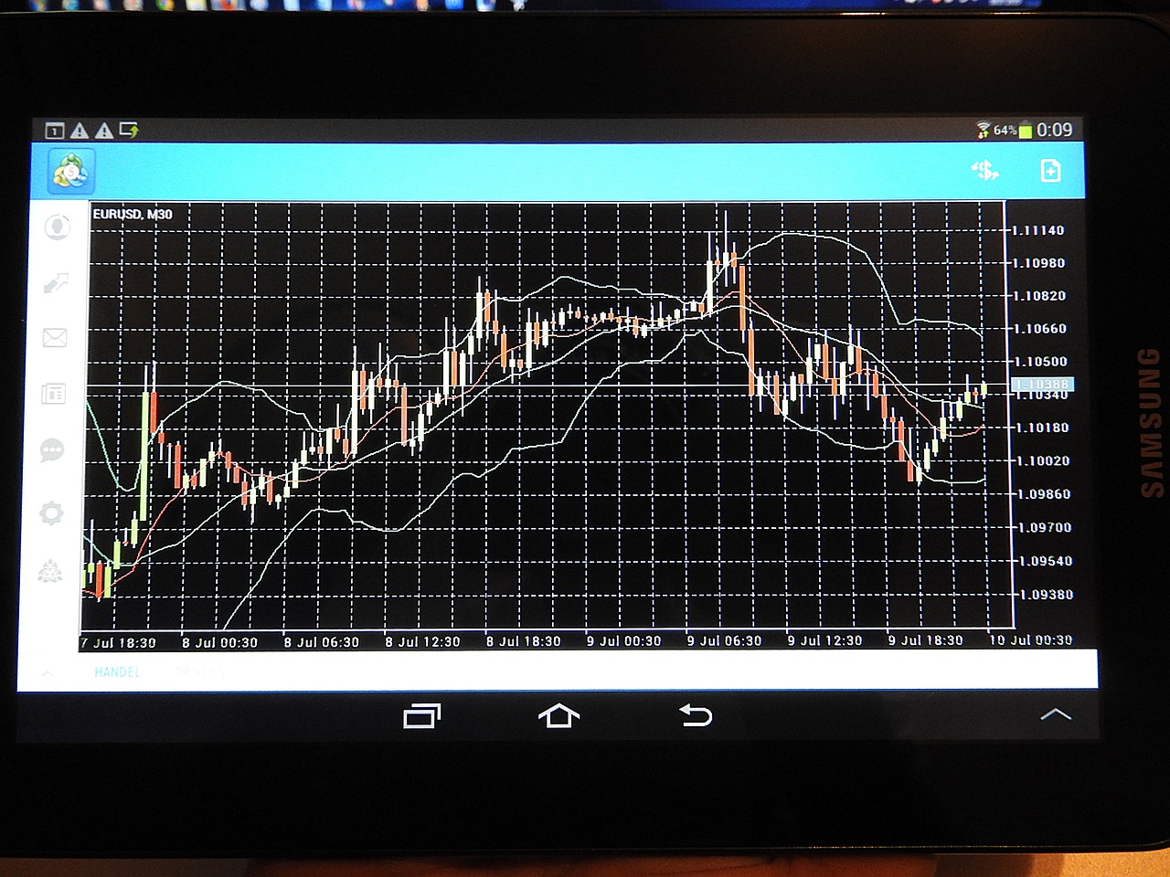
Moving averages are a fundamental tool in the arsenal of any trader looking to enhance their market analysis. They serve as a way to smooth out price data over a specified period, allowing traders to identify trends more clearly. Imagine trying to find your way through a foggy landscape; moving averages act like a flashlight, illuminating the path ahead, helping you see where the market is heading without the noise of daily price fluctuations.
There are two primary types of moving averages that traders commonly use: Simple Moving Averages (SMA) and Exponential Moving Averages (EMA). Each of these averages has its own unique characteristics and applications:
| Type | Description | Use Case |
|---|---|---|
| Simple Moving Average (SMA) | Averages price data over a specific number of periods, giving equal weight to all prices. | Best for identifying long-term trends. |
| Exponential Moving Average (EMA) | Gives more weight to recent prices, making it more responsive to new information. | Ideal for short-term trading strategies. |
When utilizing moving averages, traders often look for crossovers as signals for potential trades. For example, when a short-term moving average crosses above a long-term moving average, it may indicate a bullish trend, while the opposite crossover could suggest a bearish trend. This is akin to a traffic light; a green light signals go, while a red light warns you to stop. Understanding these signals can be crucial for making timely trading decisions.
Furthermore, moving averages can also serve as dynamic support and resistance levels. When the price approaches a moving average, it often reacts to it, bouncing off or breaking through. This behavior can provide traders with additional insights into potential entry and exit points. It's like having a guide on a treacherous mountain trail—knowing where the pitfalls are can save you from a fall.
In conclusion, moving averages are not just numbers on a chart; they are powerful indicators that can significantly improve your trading strategy. By understanding how to apply both SMA and EMA effectively, traders can gain a clearer perspective on market trends and make more informed decisions. So, the next time you look at a trading chart, remember the importance of these averages—they could be the key to unlocking your trading potential!
- What is the main difference between SMA and EMA? The main difference lies in how they weigh price data; SMA gives equal weight to all prices, while EMA gives more weight to recent prices.
- How can I determine which moving average to use? It depends on your trading strategy. For long-term trends, SMA might be more suitable, while EMA is better for short-term trades.
- Can moving averages be used in all markets? Yes, moving averages can be applied across various markets, including stocks, forex, and cryptocurrencies.
Relative Strength Index (RSI)
The is a powerful momentum oscillator that plays a crucial role in technical analysis. It measures the speed and change of price movements, providing traders with valuable insights into market conditions. Essentially, the RSI evaluates whether an asset is overbought or oversold, which can signal potential price reversals. This indicator ranges from 0 to 100, with typical thresholds set at 70 for overbought and 30 for oversold conditions. Understanding how to interpret these levels is key to making informed trading decisions.
When the RSI is above 70, it suggests that the asset may be overbought, meaning that it has experienced significant price increases in a short period. This could indicate that the price is likely to correct downward soon. Conversely, when the RSI falls below 30, it indicates that the asset may be oversold, suggesting a potential upward reversal. Traders often look for confirmation through additional indicators or chart patterns before making decisions based on RSI readings.
To illustrate how the RSI works in practice, consider the following table that summarizes the RSI levels and their implications:
| RSI Level | Market Condition | Implication |
|---|---|---|
| 0-30 | Oversold | Potential buying opportunity |
| 30-70 | Neutral | Market is stable; wait for signals |
| 70-100 | Overbought | Potential selling opportunity |
In practice, the RSI can be used in conjunction with other technical indicators to enhance trading strategies. For example, a trader might look for a divergence between the RSI and the price action. If the price is making new highs while the RSI is not, this could indicate a weakening trend, suggesting that a reversal may be imminent. On the other hand, if the price is making new lows while the RSI is showing higher lows, it could signal a bullish reversal.
Moreover, the RSI can also be used to identify trend strength. A strong trend will typically see the RSI remain above 40 during an uptrend or below 60 during a downtrend. This information can help traders gauge whether to enter or exit positions based on the prevailing market conditions.
In conclusion, mastering the Relative Strength Index can significantly enhance your trading decisions. By understanding its implications and how to interpret its readings, traders can better navigate the complexities of the market and make more informed choices.
- What is the best RSI setting for trading? Most traders use the default setting of 14 periods, but you can adjust it based on your trading style.
- Can RSI be used for all types of trading? Yes, RSI can be applied to various trading styles, including day trading, swing trading, and long-term investing.
- Is RSI a reliable indicator? While RSI is a valuable tool, it should not be used in isolation. Combining it with other indicators can improve its reliability.
Frequently Asked Questions
- What are exchange charts and why are they important?
Exchange charts are graphical representations of market data that help traders visualize price movements, trends, and patterns. They are crucial because they provide insights that can lead to informed trading decisions, helping traders to anticipate market behavior.
- What types of exchange charts are commonly used?
There are three primary types of exchange charts: line charts, bar charts, and candlestick charts. Line charts offer a simple view of price trends over time, bar charts provide a detailed view of price fluctuations, and candlestick charts are favored for their ability to convey market sentiment and potential reversals.
- How do I read chart patterns effectively?
Reading chart patterns involves recognizing formations such as head and shoulders, triangles, and flags. These patterns can indicate potential price movements, and by understanding them, traders can make strategic decisions about when to enter or exit trades.
- What are technical indicators and how do they enhance trading?
Technical indicators are mathematical calculations based on price, volume, or open interest of a security. They enhance trading by providing additional insight into market conditions, helping traders identify trends and make more informed decisions based on historical data.
- What is the difference between simple and exponential moving averages?
Simple moving averages (SMA) calculate the average price over a specific period, giving equal weight to all prices. Exponential moving averages (EMA), on the other hand, give more weight to recent prices, making them more responsive to new information. This can help traders identify trends more quickly.
- How does the Relative Strength Index (RSI) work?
The RSI is a momentum oscillator that measures the speed and change of price movements. It ranges from 0 to 100 and helps traders identify overbought or oversold conditions. An RSI above 70 typically indicates that a security may be overbought, while an RSI below 30 suggests it may be oversold.

