Understanding the Basics of Technical Analysis for Beginners
Welcome to the fascinating world of trading! If you're just stepping into this arena, you might be feeling a bit overwhelmed by the plethora of information available. Don't worry! This article aims to simplify the concept of technical analysis and help you understand its importance in navigating the financial markets. Think of technical analysis as a map. Just like a map helps you find your way through unknown territory, technical analysis guides traders through the complex landscape of price movements and trends.
So, what exactly is technical analysis? In essence, it's the study of price movements and trading volumes over time to forecast future market behavior. Unlike fundamental analysis, which focuses on a company's financial health and economic factors, technical analysis is all about the numbers—specifically, the historical prices and volumes of a security. By analyzing these patterns, traders can make informed decisions about when to buy or sell. It's like trying to predict the weather: you look at past patterns to forecast what might happen next.
One of the key aspects of technical analysis is understanding that the market is driven by the psychology of traders. Emotions such as fear and greed can lead to price fluctuations, and technical analysis helps to capture these sentiments through various tools and indicators. By learning to read these signals, you can gain an edge in the market. Imagine being able to predict the next wave at the beach—technical analysis provides you with the tools to ride those waves successfully.
As we delve deeper, you'll discover that technical analysis is not just about charts and numbers; it's a toolkit filled with various methods and strategies. From identifying trends to spotting reversals, the skills you acquire will empower you to make better trading decisions. Are you ready to unlock the secrets of the market? Let's dive into the fundamentals of technical analysis and explore the essential concepts that every beginner should know!
Technical analysis revolves around a few core principles. Firstly, it operates on the assumption that all relevant information is already reflected in the price. This means that the current price of a security is the best indicator of its future movement. Secondly, technical analysts believe that prices move in trends. Recognizing these trends can help traders predict future price movements. Lastly, historical price movements tend to repeat themselves due to market psychology, allowing traders to use past data to inform their future strategies.
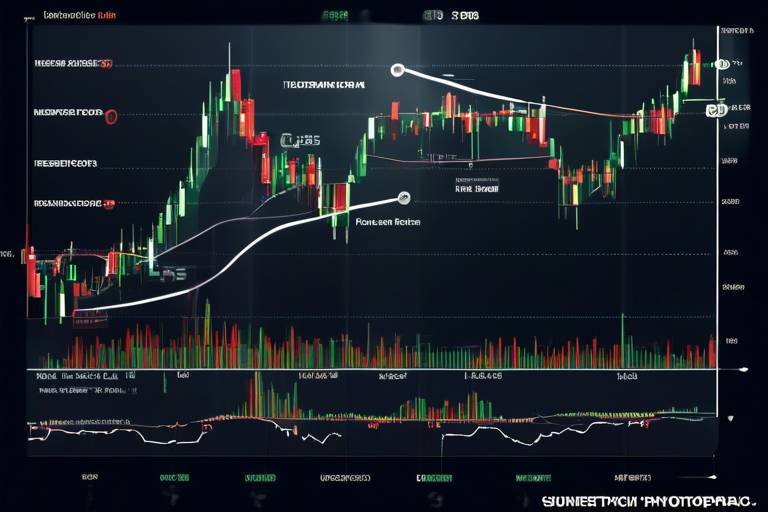
Now, let's talk about the tools of the trade. Technical analysis is not just a guessing game; it involves a variety of tools and indicators that help traders make informed decisions. Some of the most popular tools include:
- Moving Averages: These help smooth out price data to identify trends over a specific period.
- Relative Strength Index (RSI): This momentum oscillator measures the speed and change of price movements, helping traders identify overbought or oversold conditions.
- Moving Average Convergence Divergence (MACD): This indicator shows the relationship between two moving averages of a security's price, helping to identify potential buy or sell signals.
Each of these tools serves a unique purpose, and mastering them can significantly enhance your trading strategy.
Understanding different chart types is crucial for visualizing market data effectively. The three most common chart types are:
- Line Charts: These display closing prices over time and provide a clear view of price trends.
- Bar Charts: These show opening, closing, high, and low prices for a specific time period, offering more detailed information than line charts.
- Candlestick Charts: These are similar to bar charts but provide a more visual representation of price movements within a specific time frame.
Each chart type has its strengths, and understanding how to interpret them is essential for any trader.
Q1: What is the difference between technical analysis and fundamental analysis?
A1: Technical analysis focuses on price movements and trading volumes, while fundamental analysis evaluates a company's financial health and economic factors.
Q2: Do I need advanced knowledge to start using technical analysis?
A2: Not at all! Technical analysis can be learned step by step, and beginners can start with basic concepts and gradually build their knowledge.
Q3: Can technical analysis guarantee profits?
A3: While technical analysis can improve your trading decisions, it doesn't guarantee profits. It's essential to combine it with sound risk management strategies.

The Fundamentals of Technical Analysis
Technical analysis is like the compass for traders, guiding them through the often turbulent waters of the financial markets. At its core, technical analysis involves studying price movements and trading volumes to forecast future market behavior. Imagine trying to navigate a ship without a map or compass; that’s what trading without technical analysis feels like. Unlike fundamental analysis, which focuses on a company’s financial health, earnings, and economic factors, technical analysis dives into the patterns and trends created by market participants’ actions.
One of the key principles of technical analysis is the belief that all relevant information is already reflected in the stock price. This idea stems from the efficient market hypothesis, which suggests that prices move in response to new information. Therefore, the price charts themselves become the primary source of data, allowing traders to make informed decisions based on historical trends. This method is particularly beneficial for short-term traders looking to capitalize on small price movements.
Understanding the basics of technical analysis also means grasping the importance of market psychology. Traders are not robots; emotions play a significant role in their decision-making. Fear and greed can lead to irrational behavior, creating patterns that technical analysts can identify. For instance, when the market is on a bullish run, many traders may jump in, driven by greed, pushing prices even higher. Conversely, during a bearish trend, fear can cause a mass sell-off, leading to significant price drops. Recognizing these emotional patterns can give traders an edge in predicting future movements.
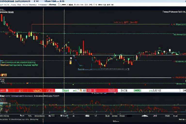
Another fundamental concept is the idea of support and resistance levels. Support refers to a price level where a stock tends to stop falling and may bounce back up, while resistance is where the price struggles to rise above. Think of support as a safety net that catches a falling price, and resistance as a ceiling that restricts upward movement. Identifying these levels can help traders make strategic decisions about when to enter or exit a trade. For example, if a stock approaches a strong support level, it may be a good opportunity to buy, anticipating a bounce back.
Moreover, technical analysis often employs various tools and indicators to help traders interpret market data. These tools can range from simple moving averages to more complex oscillators. Each tool serves a different purpose, and understanding how to use them effectively can enhance a trader's strategy. For instance, moving averages smooth out price data to identify trends, while momentum indicators like the Relative Strength Index (RSI) can indicate whether a stock is overbought or oversold.
In summary, the fundamentals of technical analysis provide a solid foundation for any aspiring trader. By understanding price movements, market psychology, and key concepts like support and resistance, traders can navigate the financial markets with greater confidence. As you delve deeper into the world of technical analysis, remember that practice and continuous learning are your best allies. The more you familiarize yourself with charts and indicators, the more intuitive your trading decisions will become.

Key Tools and Indicators
When it comes to technical analysis, having the right tools and indicators at your disposal is like having a compass in the wilderness. It guides you through the often chaotic world of financial markets, helping you make informed decisions. There are several key tools that traders rely on to analyze market trends and price movements effectively. Let's dive into some of the most popular ones, including moving averages, the Relative Strength Index (RSI), and the Moving Average Convergence Divergence (MACD).
Moving Averages are one of the simplest yet most powerful tools in a trader's arsenal. They smooth out price data to create a trend-following indicator that can help you identify the direction of the market. Essentially, moving averages calculate the average price of a security over a specific period, which can be adjusted according to your trading strategy. For example, a 50-day moving average provides insight into the medium-term trend, while a 200-day moving average gives a longer-term perspective. When the price crosses above the moving average, it might signal a buying opportunity, while a drop below could indicate a sell signal.
Next up is the Relative Strength Index (RSI). This momentum oscillator measures the speed and change of price movements, providing insights into whether a security is overbought or oversold. The RSI ranges from 0 to 100 and is typically plotted on a chart below the price action. A reading above 70 often suggests that a security is overbought, while a reading below 30 indicates it may be oversold. By understanding these levels, traders can make more informed decisions about when to enter or exit trades.
Then we have the Moving Average Convergence Divergence (MACD). This tool is a trend-following momentum indicator that shows the relationship between two moving averages of a security’s price. The MACD is calculated by subtracting the 26-period Exponential Moving Average (EMA) from the 12-period EMA. The result is the MACD line, which traders then compare to a signal line (usually a 9-period EMA of the MACD line) to identify potential buy and sell signals. When the MACD line crosses above the signal line, it can indicate a bullish trend, whereas crossing below may suggest a bearish trend.
To sum it up, these tools are essential for any trader looking to navigate the financial markets effectively. By combining the insights gained from moving averages, RSI, and MACD, you can develop a more comprehensive understanding of market dynamics. But remember, while these indicators are powerful, they should not be used in isolation. Always consider them in the context of overall market conditions and other technical signals.
- What is the best technical indicator for beginners? While there isn’t a one-size-fits-all answer, many beginners find moving averages and RSI to be user-friendly and effective for understanding market trends.
- Can I rely solely on technical analysis for trading? It's best to use technical analysis in conjunction with fundamental analysis and market news to make well-rounded trading decisions.
- How often should I check my indicators? This depends on your trading style. Day traders may check indicators multiple times a day, while swing traders might look at them daily or weekly.

Chart Types Explained
When it comes to technical analysis, understanding chart types is like having the right map before embarking on a journey. Each chart type provides unique insights into market behavior, allowing traders to visualize price movements and make informed decisions. Let's dive into some of the most popular chart types that every beginner should know.
First up, we have the line chart. This is the simplest of all chart types, displaying only the closing prices over a specified period. Imagine it as a straightforward timeline of price action, connecting the dots between closing prices. The beauty of line charts lies in their clarity; they help traders quickly identify overall trends without the clutter of additional data. However, while they are excellent for spotting trends, they may not provide enough detail for more intricate analysis.
Next, we have the bar chart. Unlike line charts, bar charts provide more information by displaying the open, high, low, and close prices (OHLC) for a given time period. Each bar represents a specific time frame, and the height of the bar indicates the price range. This means that traders can see not only where the price closed but also how volatile it was during that period. For example, a long bar suggests significant price movement, while a short bar indicates relative stability. Bar charts are particularly useful for traders looking to analyze price action more deeply.
Now, let’s talk about the candlestick chart, which has become increasingly popular among traders. A candlestick chart provides the same OHLC data as a bar chart but does so in a visually engaging way. Each candlestick consists of a body and wicks (or shadows) that represent the price movement. The body shows the opening and closing prices, while the wicks indicate the highest and lowest prices during that time frame. A green (or white) candlestick indicates that the closing price was higher than the opening price, suggesting bullish sentiment, while a red (or black) candlestick indicates the opposite—bearish sentiment. This visual representation makes it easier to spot market trends and reversals at a glance.
To help you understand these chart types better, here's a quick comparison:
| Chart Type | Information Provided | Best For |
|---|---|---|
| Line Chart | Closing prices | Identifying overall trends |
| Bar Chart | Open, High, Low, Close (OHLC) | Detailed price analysis |
| Candlestick Chart | OHLC with visual representation | Spotting trends and market sentiment |
In conclusion, understanding these chart types is essential for any trader looking to navigate the financial markets effectively. Each chart type serves a different purpose, and knowing when to use each one can significantly enhance your trading strategy. Whether you prefer the simplicity of line charts, the detailed insights of bar charts, or the visually appealing candlestick charts, mastering these tools will empower you to make better trading decisions.
- What is the best chart type for beginners? Line charts are often recommended for beginners due to their simplicity and clarity.
- How do I choose the right chart type? It depends on your trading style and the level of detail you require. Experiment with different types to see what works best for you.
- Can I use multiple chart types? Absolutely! Many traders use a combination of chart types to gain a comprehensive view of the market.

Line Charts
Line charts are among the most straightforward and effective tools for visualizing price movements in financial markets. They display the closing prices of a security over a specified period, connecting these points with a continuous line. This simplicity makes them particularly appealing to beginners who may feel overwhelmed by more complex chart types. By focusing solely on closing prices, line charts provide a clear view of the overall market direction without the noise that can come from intraday price fluctuations.
When you look at a line chart, it’s like peering through a window into the past, allowing you to see how a stock or asset has performed over time. For instance, if you were to examine a line chart for a popular stock, you might notice trends that indicate whether the price is generally rising, falling, or remaining stable. This can be immensely helpful in making informed trading decisions. But how do you interpret these trends? Here are a few key points to consider:
- Trend Identification: A rising line indicates an uptrend, while a descending line suggests a downtrend. Flat lines can indicate consolidation.
- Time Frame Selection: The time frame you choose can significantly affect your analysis. Short-term charts may show volatility, whereas long-term charts can reveal broader trends.
- Support and Resistance Levels: Line charts can help identify critical levels where prices tend to bounce back (support) or reverse (resistance).
One of the best aspects of line charts is their ability to simplify complex data into an easily digestible format. Imagine you’re trying to follow a friend’s story, but they keep jumping back and forth in time. It would be confusing, right? Line charts eliminate that confusion by presenting a clear narrative of price movement over time. They help you focus on the bigger picture rather than getting lost in the minutiae.
However, while line charts are fantastic for understanding price trends, they do have limitations. They do not provide information about trading volume, which can be a critical factor in confirming trends. For example, a price increase accompanied by high volume is generally more significant than the same increase with low volume. Therefore, while line charts are an excellent starting point for beginners, it’s advisable to combine them with other forms of analysis for a more comprehensive view of the market.
In conclusion, line charts serve as a fundamental building block in the world of technical analysis. They offer a clear, visual representation of price movements, making them an ideal choice for traders just starting out. By mastering line charts, you can gain valuable insights into market trends and develop a solid foundation for your trading strategy.

Candlestick Charts
Candlestick charts are like the storytellers of the trading world; they provide a rich narrative about price movements within a specific time frame. Each candlestick represents four key pieces of information: the open, close, high, and low prices for that period. By visualizing this data, traders can glean insights into market sentiment and potential future movements. Imagine each candlestick as a chapter in a book, where the color and shape of the candle can indicate whether the market is bullish (rising) or bearish (falling).
One of the most intriguing aspects of candlestick charts is their ability to convey emotions and psychology of market participants. A green candlestick typically signifies that the closing price was higher than the opening price, suggesting buying pressure, while a red candlestick indicates the opposite. This color coding helps traders quickly assess market conditions at a glance.
But there’s more to candlestick charts than just colors. Each candlestick's body and wicks (or shadows) tell their own story. The body represents the range between the opening and closing prices, while the wicks extend to the highest and lowest prices reached during that period. For instance, a long body with short wicks suggests a strong trend, whereas a short body with long wicks can indicate indecision in the market. This can be crucial for traders trying to gauge whether to enter or exit a position.
To illustrate the components of a candlestick, consider the following table:
| Component | Description |
|---|---|
| Open | The price at which the asset began trading during the time period. |
| Close | The price at which the asset finished trading during the time period. |
| High | The highest price reached during the time period. |
| Low | The lowest price reached during the time period. |
Traders often look for specific patterns in candlestick formations to predict future price movements. For example, a hammer candlestick can indicate a potential reversal after a downtrend, while a doji signifies uncertainty in the market. Recognizing these patterns can be a game-changer for traders, acting like a compass guiding them through the often tumultuous waters of trading.
In summary, candlestick charts are a powerful tool for traders seeking to understand market dynamics. By interpreting the information conveyed through the candlesticks, traders can make more informed decisions, enhancing their ability to navigate the financial markets effectively. So, the next time you look at a candlestick chart, remember that each candle holds a story waiting to be uncovered!
- What is the main advantage of using candlestick charts? Candlestick charts provide detailed information about price movements, including open, close, high, and low prices, which helps traders make informed decisions.
- How do I interpret a doji candlestick? A doji candlestick indicates indecision in the market, where the opening and closing prices are virtually the same. It suggests that neither buyers nor sellers are in control.
- Can I use candlestick patterns for long-term trading? Yes, while candlestick patterns are often used for short-term trading, they can also provide valuable insights for long-term trends.

Common Patterns in Technical Analysis
When diving into the world of technical analysis, one of the most exciting aspects is recognizing price patterns. These patterns serve as the market's way of communicating potential future movements. Think of them as the road signs guiding traders through the often turbulent waters of financial markets. By understanding these patterns, traders can make more informed decisions and potentially increase their profitability.
Some of the most common patterns that traders look for include the head and shoulders, triangles, and flags. Each of these patterns has its own implications and can signal different market behaviors. For instance, the head and shoulders pattern is often seen as a reversal signal, indicating that a bullish trend may be about to change direction. On the other hand, triangles can signal a continuation of the current trend, whether it be bullish or bearish.
Here’s a brief overview of these key patterns:
| Pattern | Description | Market Implication |
|---|---|---|
| Head and Shoulders | A pattern that resembles a head between two shoulders, indicating a potential trend reversal. | Bearish reversal after an uptrend. |
| Triangles | Formed by converging trend lines, indicating a period of consolidation before a breakout. | Continuation of the current trend. |
| Flags | Short-term patterns that appear after a strong price movement, resembling a flag on a pole. | Continuation of the previous trend. |
Understanding these patterns is not just about identifying them; it’s also about interpreting what they mean in the context of the broader market. For example, a head and shoulders pattern may be more significant if it occurs at a resistance level, suggesting a stronger likelihood of a trend reversal. Similarly, recognizing the context of a triangle pattern can help traders anticipate whether a breakout will be to the upside or downside based on the preceding trend.
Moreover, it’s essential to combine pattern recognition with other technical indicators to strengthen trading decisions. Indicators like the Relative Strength Index (RSI) or Moving Averages can provide additional confirmation of the signals generated by these patterns. This multi-faceted approach can dramatically enhance a trader's ability to predict future price movements accurately.
In conclusion, mastering common patterns in technical analysis is a crucial step for any aspiring trader. These patterns not only help in understanding market sentiment but also provide valuable insights into potential price movements. So, the next time you look at a price chart, remember to keep an eye out for these patterns—they might just lead you to your next successful trade!
- What is a head and shoulders pattern?
A head and shoulders pattern is a reversal pattern that indicates a potential change in trend direction, typically from bullish to bearish.
- How can I identify triangles in charts?
Triangles are identified by drawing trend lines along the highs and lows of price movements, converging to a point.
- What role do indicators play in pattern recognition?
Indicators can provide additional confirmation of the signals generated by patterns, helping to enhance trading decisions.

Risk Management Strategies
When it comes to trading, the thrill of potential profits can often overshadow the need for a solid risk management strategy. However, without effective risk management, even the most skilled traders can find themselves facing significant losses. Think of it as a safety net; it allows you to take calculated risks while ensuring that you don’t fall too far if things go south. So, what are some of the most effective risk management strategies that every trader should consider?
First and foremost, setting stop-loss orders is crucial. A stop-loss order is like a preemptive strike against potential losses. It automatically sells a security when it reaches a certain price, thereby limiting your losses. For instance, if you buy a stock at $50 and set a stop-loss at $45, your maximum loss is capped at $5 per share. This is an essential tool for managing risk, especially in volatile markets where prices can swing wildly.
Another vital aspect of risk management is position sizing. This refers to determining how much of your capital you should risk on a single trade. A common rule of thumb is to risk no more than 1-2% of your trading capital on any one trade. For example, if you have a $10,000 trading account, risking 1% means you would only risk $100 on a trade. This strategy not only protects your capital but also allows you to withstand a series of losses without wiping out your account.
To illustrate the importance of position sizing, consider the following table:
| Account Size | Risk per Trade (1%) | Risk per Trade (2%) |
|---|---|---|
| $10,000 | $100 | $200 |
| $20,000 | $200 | $400 |
| $50,000 | $500 | $1,000 |
Additionally, diversifying your portfolio can significantly help in managing risk. By spreading your investments across various asset classes or sectors, you can reduce the impact of a poor-performing investment on your overall portfolio. For example, instead of putting all your money into tech stocks, consider investing in a mix of stocks, bonds, and commodities. This way, if one asset class takes a hit, your other investments can help cushion the blow.
Lastly, always remember the importance of emotional discipline in trading. Fear and greed can lead traders to make impulsive decisions that jeopardize their risk management strategies. It’s essential to stick to your trading plan and avoid making emotional trades. Keeping a trading journal can help track your decisions and emotions, allowing you to learn from past mistakes and improve your discipline over time.
In summary, effective risk management strategies are not just optional; they are fundamental to successful trading. By setting stop-loss orders, determining appropriate position sizes, diversifying your portfolio, and maintaining emotional discipline, you can protect your capital and enhance your chances of long-term success in the financial markets.
- What is a stop-loss order? A stop-loss order is a predetermined price at which a trader will sell a security to limit their losses.
- How do I determine my position size? Position size can be calculated based on your total account balance and the percentage of risk you are willing to take per trade.
- Why is diversification important? Diversification helps spread risk across different assets, reducing the impact of a poor-performing investment.
- How can I improve my emotional discipline? Keeping a trading journal and sticking to a well-defined trading plan can help improve emotional discipline.

Setting Stop-Loss Orders
When it comes to trading, one of the most critical concepts to grasp is the stop-loss order. Think of it as your safety net, designed to catch you before you fall too deep into the abyss of potential losses. A stop-loss order is an instruction to sell a security when it reaches a certain price, effectively limiting your losses on a trade. But how do you set it correctly? That’s where the magic happens!
First and foremost, it's essential to determine your risk tolerance. This is the amount of money you’re willing to lose on a trade before you pull the plug. For instance, if you have a $1,000 trading account and decide that you’re comfortable risking 2% of your capital on a single trade, your stop-loss should be set to ensure that a loss doesn’t exceed $20. This means that if the trade goes against you, you’ll exit before the losses become too painful.
Next, consider the market volatility. If you’re trading in a highly volatile market, a tighter stop-loss might get triggered too quickly, causing you to exit a position prematurely. On the flip side, a wider stop-loss can help you ride out the market's fluctuations but may expose you to larger losses. Striking a balance is crucial. A good rule of thumb is to set your stop-loss based on the asset's recent price action, perhaps using support and resistance levels as your guide.
Here’s a quick example to illustrate how to set a stop-loss:
| Trade Entry Price | Risk Tolerance (%) | Stop-Loss Price |
|---|---|---|
| $50 | 2% | $49 |
| $50 | 5% | $47.50 |
In this table, you can see how different risk tolerances affect the stop-loss price. If you enter a trade at $50 and decide to risk 2%, your stop-loss would be set at $49. However, if you’re willing to risk 5%, you’d set it at $47.50. This visual representation helps in understanding how to calculate your stop-loss based on your risk appetite.
Moreover, it's essential to remember that setting a stop-loss is not a one-time deal. As the trade progresses, you should continuously evaluate your position and adjust your stop-loss accordingly. This technique is often referred to as a trailing stop-loss, where you move the stop-loss up as the price increases, locking in profits while still protecting against potential downturns.
Ultimately, the goal of setting stop-loss orders is to maintain discipline and protect your trading capital. It’s like having a personal bodyguard for your investments, ensuring that you don’t get carried away by emotions during trading. So, the next time you place a trade, take a moment to think about your stop-loss strategy. It could be the difference between a successful trade and a costly mistake!
- What is a stop-loss order? A stop-loss order is an instruction to sell a security when it reaches a specific price to limit potential losses.
- How do I determine where to set my stop-loss? Your stop-loss should be based on your risk tolerance, market volatility, and recent price action, often using support and resistance levels as guidance.
- Can I adjust my stop-loss after entering a trade? Yes! It's advisable to adjust your stop-loss as the trade develops to lock in profits and protect against significant losses.
- What is a trailing stop-loss? A trailing stop-loss is a dynamic stop-loss that moves up with the market price, helping to secure profits while still allowing for potential gains.

Position Sizing Techniques
When it comes to trading, one of the most critical aspects that can make or break your success is position sizing. Think of it as the foundation of your trading strategy. Just like a house needs a solid base to stand tall, your trading needs well-calculated position sizes to weather the market's ups and downs. So, how do you determine the right size for each trade? Let's dive into some key techniques that can help you manage your risk effectively.
First off, a fundamental concept you need to grasp is the risk-reward ratio. This ratio helps you assess how much you stand to gain against how much you could potentially lose. A common practice is to aim for a risk-reward ratio of at least 1:2, meaning for every dollar you risk, you should aim to make two. This way, even if you lose more trades than you win, you can still come out ahead in the long run.
Next, let’s talk about the percentage of your account balance that you are willing to risk on a single trade. A widely accepted guideline is to risk no more than 1-2% of your total trading capital on any one trade. For example, if you have a trading account of $10,000, risking 1% means you would only risk $100 on a single trade. This is a smart way to protect your account from significant losses while still allowing for growth.
Another effective technique is the Kelly Criterion. This formula helps you determine the optimal size of your position based on your win rate and the ratio of your average win to your average loss. The formula looks like this:
f* (bp - q) / b
Where:
- f* fraction of your bankroll to wager
- b odds received on the wager
- p probability of winning
- q probability of losing (1 - p)
This method can be quite powerful, but it requires accurate data about your trading performance. If you’re just starting out, it might be better to stick with simpler methods until you gain more experience.
Lastly, consider using a position sizing calculator. Many online tools can help you quickly calculate the right position size based on your account balance, risk percentage, and the distance to your stop-loss. These calculators take the guesswork out of the equation, allowing you to focus more on your trading strategy rather than the math behind it.
In summary, mastering position sizing techniques is essential for any trader looking to succeed in the financial markets. By understanding your risk-reward ratio, limiting your risk per trade, applying the Kelly Criterion, and utilizing position sizing calculators, you can build a robust trading strategy that keeps your losses in check and your profits growing. Remember, in trading, it’s not just about making money; it’s about protecting what you have while allowing it to flourish!
- What is position sizing? Position sizing refers to the amount of capital that a trader allocates to a specific trade, which is crucial for managing risk.
- How do I determine my risk per trade? A common guideline is to risk no more than 1-2% of your total trading capital on any single trade.
- What is the Kelly Criterion? The Kelly Criterion is a formula used to determine the optimal size of a series of bets or trades based on your win rate and the ratio of your average win to your average loss.
- Are there tools to help with position sizing? Yes, there are many online calculators that can assist you in determining the appropriate position size based on your risk parameters.
Frequently Asked Questions
- What is technical analysis?
Technical analysis is a method used to evaluate and forecast the future price movements of securities based on historical price data and trading volume. By analyzing charts and indicators, traders can identify patterns and trends that help them make informed decisions in the financial markets.
- How does technical analysis differ from fundamental analysis?
While technical analysis focuses on price movements and market trends, fundamental analysis evaluates a security's intrinsic value by examining economic factors, financial statements, and overall market conditions. In short, technical analysis looks at the "what" and "when," whereas fundamental analysis delves into the "why."
- What are some key tools and indicators used in technical analysis?
Some essential tools and indicators include moving averages, Relative Strength Index (RSI), and Moving Average Convergence Divergence (MACD). These tools help traders assess market momentum, identify trends, and make better trading decisions.
- What types of charts are commonly used in technical analysis?
Traders often use line charts, bar charts, and candlestick charts. Each type provides different insights into price movements. For instance, candlestick charts offer detailed information about price action within specific time frames, making them popular among traders.
- What is a stop-loss order, and why is it important?
A stop-loss order is a risk management tool that automatically sells a security when its price reaches a predetermined level. This helps traders limit potential losses and protect their investments, making it a crucial component of a successful trading strategy.
- How can I determine the right position size for my trades?
Determining the right position size involves assessing your account balance, risk tolerance, and the specific trade setup. Various techniques can help, such as the percentage risk method, where you risk a fixed percentage of your account on each trade.
- Can beginners successfully use technical analysis?
Absolutely! While technical analysis may seem complex at first, beginners can effectively use it by starting with the basics, practicing with demo accounts, and gradually learning to interpret charts and indicators. With time and experience, anyone can become proficient.